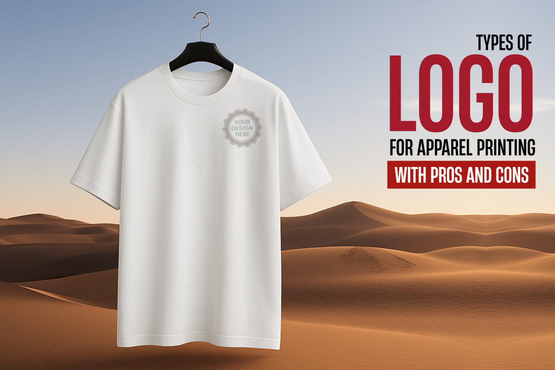
Types of Logo for Apparel Printing with Pros & Cons
Think about the last time a design on a t-shirt caught your attention. Chances are, it wasn’t just the colour or fabric, it was the logo. Whether bold, minimal, vintage, or modern, a logo instantly tells a story without saying a word. And when that story is printed on fabric, the right design style can elevate your brand in ways you didn’t expect.
From uniforms to event giveaways, the logo you select becomes the face of your brand across every garment. But before putting ink to thread, it’s worth asking yourself what kind of design actually works best.
Understanding the different types of logo is the first step in making that decision. Some logos shine on business apparel, while others feel cluttered or get lost in fabric folds. In this guide, we’re breaking it all down with insights on what works, what doesn’t, and how to pick a logo style that looks good not just on screen but also when worn out in the real world.
Most Popular Types of Logo and Where They Work Best
Every logo tells a story, but the way it tells that story depends heavily on its structure. From text-only designs to iconic symbols, here are the most widely used types of logo, each with its own advantages and best-use scenarios, especially when applied to custom apparel like polos, t-shirts, or activewear.
1. Wordmark Logos

Wordmarks use the full brand name in a distinct font style. Think Google, Coca-Cola, or Visa. These are clean, straightforward, and instantly recognizable. Wordmarks work well for newer brands that want to build name recognition and are ideal for t-shirts and polos where clarity is important.
Pros:
-
Prints clearly on any t-shirt size without distortion
-
Maintains brand visibility even on textured fabrics
Cons:
-
Needs strong typography to stand out from other printed text
-
May look too simple on large back prints if not styled creatively
2. Lettermark Logos (Monogram)

These use initials rather than full names, like IBM, CNN, or HP. Lettermarks are compact and sleek, making them a popular choice for embroidered logos on activewear or caps.
Pros:
-
Clean and compact for left-chest or sleeve prints
-
Ideal for embroidery or subtle branding on apparel
Cons:
-
May not be instantly recognizable without brand awareness
-
Can look plain if not paired with other design elements
3. Icon or Symbol Logos

Think Apple, Nike, or Twitter. These logos rely entirely on a symbol, making them visually powerful. On apparel, they offer high recognition in a small space, perfect for chest prints or sleeve placements.
Pros:
-
Stands out on minimal t-shirt designs
-
Easy to position on small areas like sleeves or necklines
Cons:
-
Can lose meaning if used without text for new brands
-
Intricate icons may blur on certain fabrics or low-resolution prints
4. Combination Logos

A mix of a symbol and text, like Adidas or Lacoste, combination logos provide flexibility. You can use the full logo on the back of a t-shirt and the symbol alone on the front pocket.
Pros:
-
Offers layout flexibility across different apparel placements
-
Balanced for front and back t-shirt prints
Cons:
-
Needs proper scaling to ensure readability and clarity
-
Slightly more complex to align during printing
5. Emblem Logos

These are badge-style logos often seen in schools, sports teams, or coffee brands like Starbucks. While visually rich, they need clean design to avoid looking crowded when printed on clothing.
Pros:
-
Creates a bold, strong identity on larger shirt areas
-
Ideal for uniforms or event apparel with a traditional feel
Cons:
-
Too much detail can get lost during printing
-
May appear cluttered on smaller apparel sizes
6. Abstract Logos

These use geometric or creative shapes to form a unique symbol, such as Pepsi or Airbnb. They stand out well on apparel if designed with balance and simplicity in mind.
Pros:
-
Unique and eye-catching on simple t-shirts
-
Works well on modern or creative apparel themes
Cons:
-
May confuse viewers if brand messaging isn’t strong
-
Detailed shapes might not transfer cleanly onto certain fabrics
7. Mascot Logos

Think KFC’s Colonel or the Pringles character. Mascots are character-based designs that bring a friendly, human element to a brand. They work best for merchandise aimed at casual or youth-focused audiences.
Pros:
-
Adds personality and friendliness to branded clothing
-
Works well for casual wear, youth merchandise, or events
Cons:
-
Overly detailed mascots may require print adjustments
-
Might not suit formal or corporate apparel settings
Choosing the Right Logo for Apparel: What Actually Prints Well
Printing a logo on apparel isn’t as simple as placing a design on a t-shirt. The logo type, fabric, printing method, and color combinations all impact the final result. Here’s how to choose a logo that prints well on custom clothing:
1. Logos That Work Well on Fabric
-
Wordmark and Lettermark Logos
These are ideal for printing because they are simple, clean, and legible. They look professional and scale easily across sizes and garment types. -
Combination Logos
Highly versatile. You can print the full logo on the front or back and use the icon separately on sleeves or tags for added branding. -
Icon or Symbol Logos
Great for compact spaces like chest prints or caps. Their simplicity makes them effective, especially on modern or minimal apparel styles.
2. Logos That Need Careful Design Adjustments
-
Emblem Logos
These include more details and borders, which can blur or become unreadable when printed small. They need to be simplified for clear printing on fabric. -
Mascot Logos
These are character-based and usually contain more colors and details. Best suited for larger print areas to preserve visual clarity.
3. Choosing the Right Printing Technique
-
Screen Printing
Best for solid designs with limited colors. Durable and cost-effective for bulk orders. -
Digital Printing
Suitable for detailed logos or those with color gradients. Works well for small to medium batch printing. -
Embroidery
Delivers a high-end finish but requires simple, bold designs. Intricate logos may not translate well in stitched form.
4. Fabric and Color Tips
-
Always use high-contrast combinations between logo and fabric color to ensure visibility.
-
Avoid complex logos on textured fabrics like pique, as the detail may get lost in the weave.
-
Request a digital mockup before production to see how the logo looks on the actual garment color and material.
5. Real-Life Recommendation
If you're ordering business t-shirts with logo, choose a wordmark or combination logo. These options ensure sharp visibility, a clean appearance, and consistent branding across all garments and sizes.
Conclusion
A logo is more than just a graphic. It represents your brand identity, especially when printed on clothing worn by your team, customers, or event attendees. Choosing the right logo type and understanding how it performs on fabric can be the difference between average-looking apparel and a strong brand statement.
Here are some key points to consider:
-
Simple logos are more effective. Clean designs print better and remain clear on different fabrics and sizes
-
Not all logo styles suit all garments. Match the design to the fabric, garment purpose, and audience
-
Use the right printing method. Screen printing, digital printing, and embroidery each serve different design needs
-
Smart placement improves visibility. Logo location can impact how your brand is perceived
-
Always test your logo with mockups before final production to avoid surprises
If you plan to buy custom t-shirts for your company, event, or promotional campaign, ensure your logo is not only well-designed but also print-ready. At Unitees by Style Union, we help brands bring their identity to life with high-quality apparel and precision logo printing.
Your logo should not just exist on a shirt. It should speak for your brand with clarity and confidence.